What even is real?
I’m still trying to work out what realism is and I’m only half joking when I say that I would write a book about realism investigating and examining the different situated interpretations of it. It’s just that I really hate writing. Generally, we could say that realism is often conflated with idealism and/or fantasy in the development of virtual worlds. For instance, Ted Kim has described the emphasis put into young, white skin in the research and development of ‘realistic’ skin rendering which indicates the bias that realism is to be found in the characteristics of one particular race and age group. The social idealism of young, white skin constructed through conventional readings of ‘beauty’ and reinforced through cosmetics and Hollywood is used to construct ‘realistic’ new worlds that reflect our misguided ideals as realistic.
However, I’m coming to think that realism is not just about comparing IRL to its simulation; comparing observed physical reality to its digital representation but about expectation and coherency. For instance, blockbuster video games unarguably have an inflated and unrealistic sense of ‘reality’ – everything is overblown and exaggerated with impossible physics and scale but the good ones have a realism that is coherent to their own worlds even if this is not realistic. Witcher 3 – empirically one of the best games of all time – displays realism that is internally coherent and draws you in but is certainly not realistic in its fantasy setting. I was rewatching the Harry Potter franchise over the last week or two with Mrs Revell and what broke the believability for me wasn’t the magic and fantasy but the lack of coherency in character behaviour such as when characters discuss key plot points within obvious earshot of each other (a recurring plot development technique in the first few films). It feels staged and incoherent with the urgency and secrecy that we’re told these plot points should be handled with.
When developing a virtual world, whether a fantasy setting or a convincing future vision, developers have to make a choice about expediency versus believability. The perception and common understanding is that more realism means more computing power. This can be got around using trickery and shortcuts or by making design choices about where detail can be sacrificed for expediency or detail is required and expediency must be sacrificed. Duplicate assets, distance fog, level of detail loading and popping textures are all indicators of these choices.
Of course not all virtual worlds strive for realism anyway. In fact, the real potential for computer graphics doesn’t lie in attempting to faithfully recreate reality but in seeing beyond it and showing new things. Years ago, I wrote a broad attempt to classify the aesthetic qualities of future visions based on their relationship to ‘realism’: Un-rendering which attempts to reveal the technical and political workings of realism, Low-rendering which intentionally uses cartoonish, reduced and low-poly imagery to encourage viewer engagement and hyper-rendering which attempt to ‘make the invisible visible’ to use the much-vaunted trope. These categories all skirt or subvert realism to engage audiences in critical thinking but it’s wholly incomplete as a typology and it feels like an aesthetic continuum that is always developing and mutating.

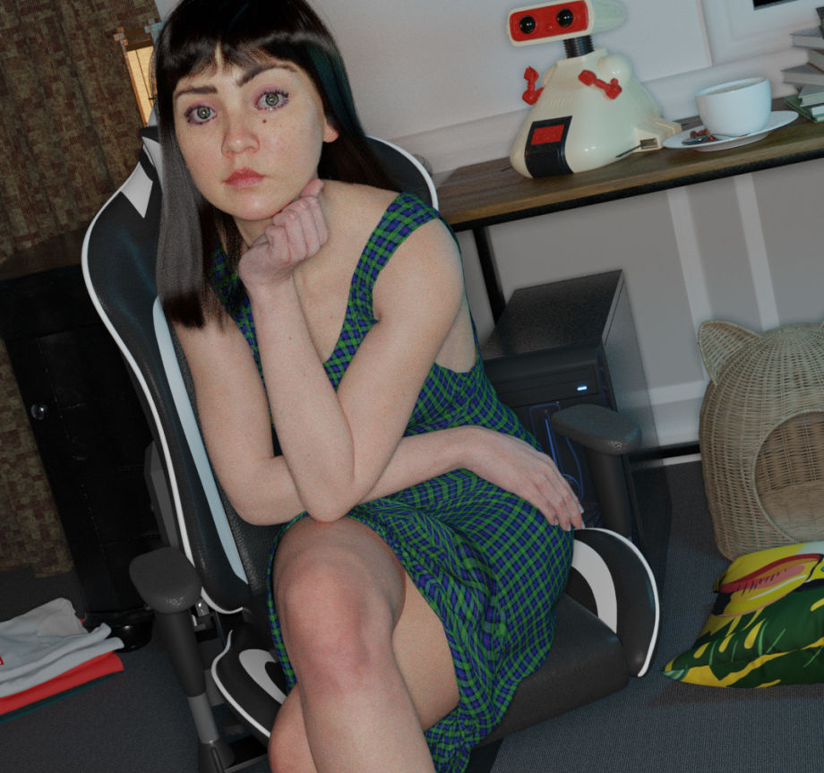
All of this was troubled when I was reminded of these curious renders by a Blender Artists poster, ‘Blitter’, which have been sat at the back of my head the last few months, occasionally re-emerging on the various boards and Subreddits I haunt. Blitter just wants to create ‘believable, realistic render of normal, mundane environments, poses, etc.’ which is something rarely seen in the painterly, hyper-real images that get the most attention and remarkable in its mundanity.
Blitter’s drive for ‘mundane environments and poses’ is reminiscent of Nick Foster’s evergreen rules for the Future Mundane. Foster suggests that there’s a relationship to be had between the idea and the audience enabled by normal, mundane, even boring settings and stories. He says that because our everyday experience of the material world is mundane, speculation should reflect this instead of the hysterical hyper-reality of mainstream product demonstrations. Importantly, Foster also highlights how our experience of the every day is flawed – things are broken and buggy and never work like they’re supposed to. Blitter has taken a similar tack, as opposed to the overwhelming but internally coherent realism of enormous, well-framed explosions, magic and lens flares, they are attempting the trickier task of grounding realism in technical flaws.
In the future, things will fail, but for the vast majority of the world this failure won’t be ‘the rocket is gonna crash into the planet,’ but ‘I can’t get the audio to work on Skype.’ The future will include taxes, illness, weather, transport delays and allergies. Things will break, things will fail to perform as promised, things will need fixing. Rendering the future as a partly broken space gives an audience something to hold onto, something relatable.
Nick Foster – The Future Mundane – 2013
Also, unlike Foster’s work on mundanity with Near Future Laboratory which is insightful, funny and seemingly always ahead of its time, the mundane realism of Blitter’s work is unnerving and spooky. The nameless character they have created falls deep inside the Uncanny Valley, creating feelings of familiar discomfort and unease, part of this is the lack of context or reading protocols – who is she? How are we supposed to read her? CGI characters like Lil Miquela jump over these issues by being contextualised in the larger-than-life performance of Instagram Influencer-dom. That is to say, I think Lil Miquela, despite being an uncanny technically realistic human is contextualised in a world of brands, product placement and idealistic lifestyles that we are tacitly aware is constructed and fake anyway and so the imposition of a CGI person, though remarkable in its own way, isn’t as unnerving since we can neatly compartmentalise her.
Blitter’s CGI character on the other hand, though also technically masterful is too eerily familiar and real. There are, of course, clues like the neatness of the hair and lack of distortion on reflective surfaces but I don’t think I’d spot it if I didn’t already know it was a render. We have all taken photos like these – bad lighting, out of focus, glaring flash, poor composition. You know, MySpace. However, in rendering, the technical construction of a CG image normally gives the creator god-like control over these factors. The composition, lighting, colour and focus can be finely controlled in a way that physical reality doesn’t even allow and so usually when constructing an image, artists (including myself) strive to perfect the inherited understanding of what is ‘good’ photographic construction: Three point light set ups, colour correction, pulled focus and rule of thirds certainly proliferate my sketches. To return to Kim’s point about skin we reflect the socially constructed ideal image as real; aspiring for an ideal as a mark of realism, as if the ideal is real.
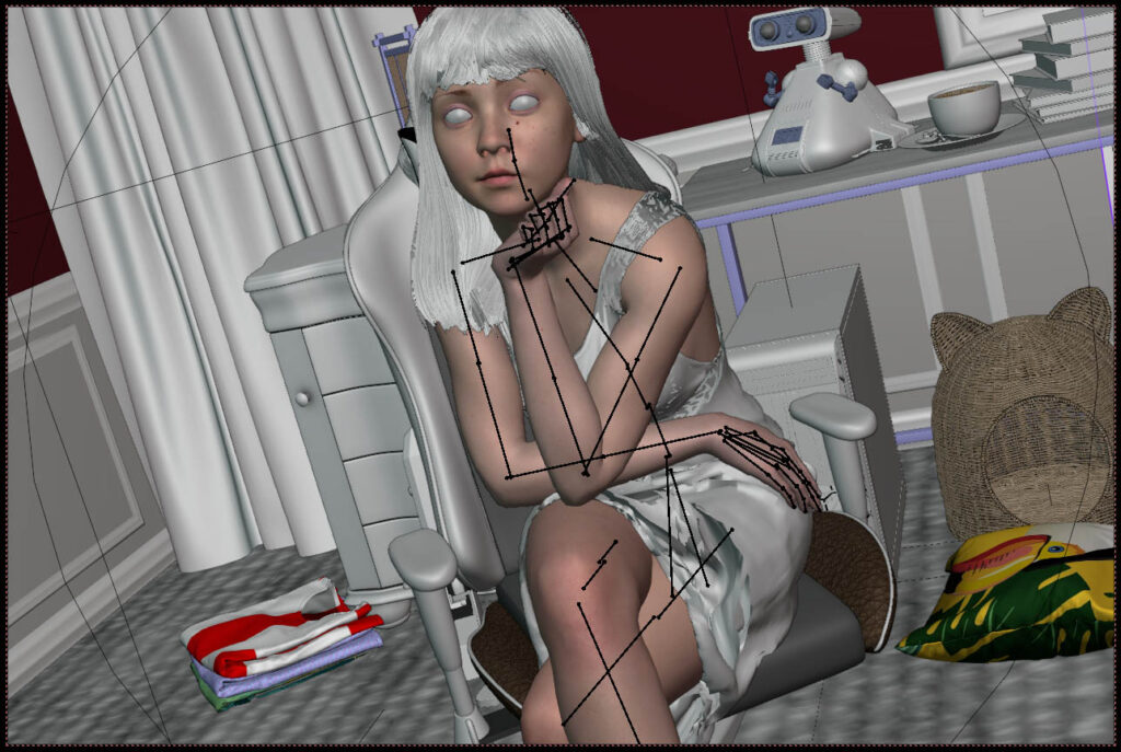
The software are usually built with these templates of good practice in mind as well – the presets in the software are designed to make the conventionally well-composed and lit image much easier to achieve and consequently automate significant parts of it like glare, motion blur and blurring. To make his images, Blitter would have had to go some way and do a good amount of work to bypass the tendencies of Blender to automate ‘good images.’

It’s a shame that Blitter has not done a deeper documentation of the process as I think it would have revealed a lot about the software to know how they would have had to unpick it to achieve ‘bad’ images. It’s worth reading the threads on some of their posts though. The respondents tread around the aesthetic choices of the image in a really interesting way, highlighting the usual problems that plague renders in the jump to realism: Everything is a perfect right angle, textures repeat, film grain in the wrong places etc. I’m going to have to write this all up into a paper at some point aren’t I?
It’s also interesting to think about where a mundane computer graphics would fit in Warburton’s Uncanny Valley typology. Warburton considers the overblown, hyper-realism of mainstream cinema and the subcultures pushing the feasible limits of simulation and rendering to reveal the workings of software or play to deeper human desires – such as all those ‘satisfying’ simulations and animations but doesn’t make space for fakery and deception: The gruelling work of convincing mediocrity. Perhaps we need a broader typology.
Short Stuff
Nope
Ok that’s it. Struggled to get my brain to do words good today to write this. Feels like a real effort so I’m cutting it short and moving on. Love you deeply, speak soon.
